

DANIEL’S MUSIC FOUNDATION / BRANDING, WEBSITE, DESIGN & CREATIVE DIRECTION, UX, COPYWRITING
Upping accessibility leads to upping growth.
Recognition:
People’s Voice Winner: The Webby Awards 2024 - Websites and Mobile Sites Accessible Technology Category
Silver: Anthem Awards 2024 - Diversity, Equity & Inclusion Partnership or Collaboration for a Product, Innovation, or Service
This project fell outside of the typical 360 advertising work I do. It was empowering to see how those skills could be adapted to help this non-profit increase their business through a better, more authentic web experience.
CHALLENGE: The non-profit Daniels Music Foundation (DMF) has been empowering people with disabilities for over two decades in NYC through physical music classes and disability awareness programs. When they adapted to offer remote programming during Covid-19, their potential to reach beyond the borders NYC exploded, and their website couldn’t keep up with the pace. They needed a big refresh that appealed to two different audiences 1) DMF students with different types of disabilities and 2) high net-worth donors and partners of all abilities; while showcasing their key qualities of Joy, Impact and Accessibility.
SOLUTION: Instead of looking at accessibility requirements as a checklist, we put the challenge at the center of the project and approached it as a creative opportunity to build an enriching experience where everyone can participate equally regardless of their specific needs, without compromising joy or impact. Nothing could be inaccessible — and nothing could be less than great design.
RESULTS: Since launch, the DMF team reported that the redesign immediately elevated their brand perception among potential donors and they saw a record high number in inquiries as interest grew exponentially from more people who wanted to work for them as instructors.
All accessible experiences are not created equal.
A quick note—accessibility is often stigmatized as a trade-off for beautiful, award-worthy design. Often times designers lean on tools that modify the primary experience entirely, or eliminate “fun” features for certain audiences in order to create an experience that meets their idea of “high design” despite it being a lesser experience for many people with accessibility needs. This can be seen in the physical world as much as the digital one. Just look at any ADA building entrance that has a lesser-than experience to the main one.
We adapted DMF’s brand for online expression and translated the heart of their in-person experience into a digital home.
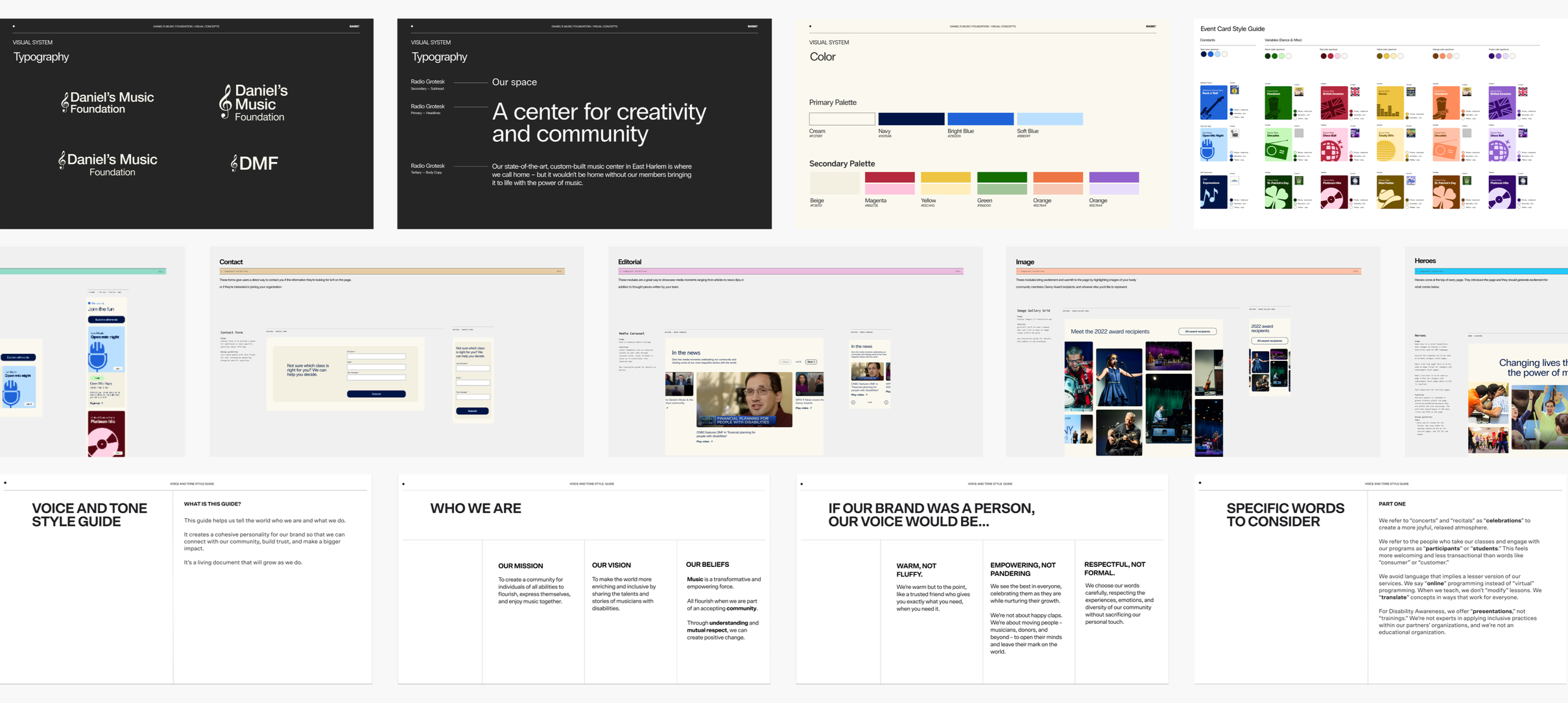

Alive with color – and contrast.
We developed and tested an extensive color pallet at the beginning of the project that would give us a wide range of color combinations to work with. It came in handy to create variety across high volume content like these event overview cards for DMF’s packed calendar.
Clarity and connection through voice and tone.
We helped DMF nurture a sense of belonging by crafting a warm, conversational voice with clear language. We treated alt text (text that screen readers read aloud to describe images) as a core part of our copy and thoughtfully chose our CTA language – like using “Play video” instead of “Watch video” to normalize all ways of enjoying an experience.

All of the experience touch points were designed to be inclusive and encourage discovery.
From the beginning, our design system accounted for accessibility in every UI element. We favored a larger scale to better serve users with visual and mobility impairments, included copy for UI elements like “Close” buttons to make actions more explicit, and leveraged subtle motion for special details like hover states to add liveliness without hindering interactions.
Showcasing impact with interactions.
We designed colorful, flippable cards with stats about the powerful results of DMF’s programs, leveraging our UI system to make the action explicitly clear. Each card includes a “Flip card” CTA to communicate how to reveal not only more in-depth descriptions of each statistic, but also DMF’s ambitious goals for the upcoming year.
Letting DMF’s thoughts shine, one tidbit at a time.
We embraced carousels to share robust information like community testimonials and DMF’s big-picture dreams. And to ensure they were screen reader accessible, we set clear expectations for the amount of content by indicating the number of slides in our UI. We also designed the cards to bleed off the screen to emphasize there was more to explore.
We even found some ways to include surprise moments of fun with Daily Smiles.
Inspired by the joy that DMF strives to bring to their community every day, we created Daily Smiles: a smiley-face animation that rolls onto the screen, reveals a quote about inclusion from an original song by DMF’s Co-Founder Daniel Trush, and then rolls away – giving people a moment to smile without getting stuck by the repetitive behaviors that we learned can hinder the experience of some of DMF’s community members.
Our work has been celebrated and recognized by the foundation as well as the Webby’s and Anthem Awards for its impact.
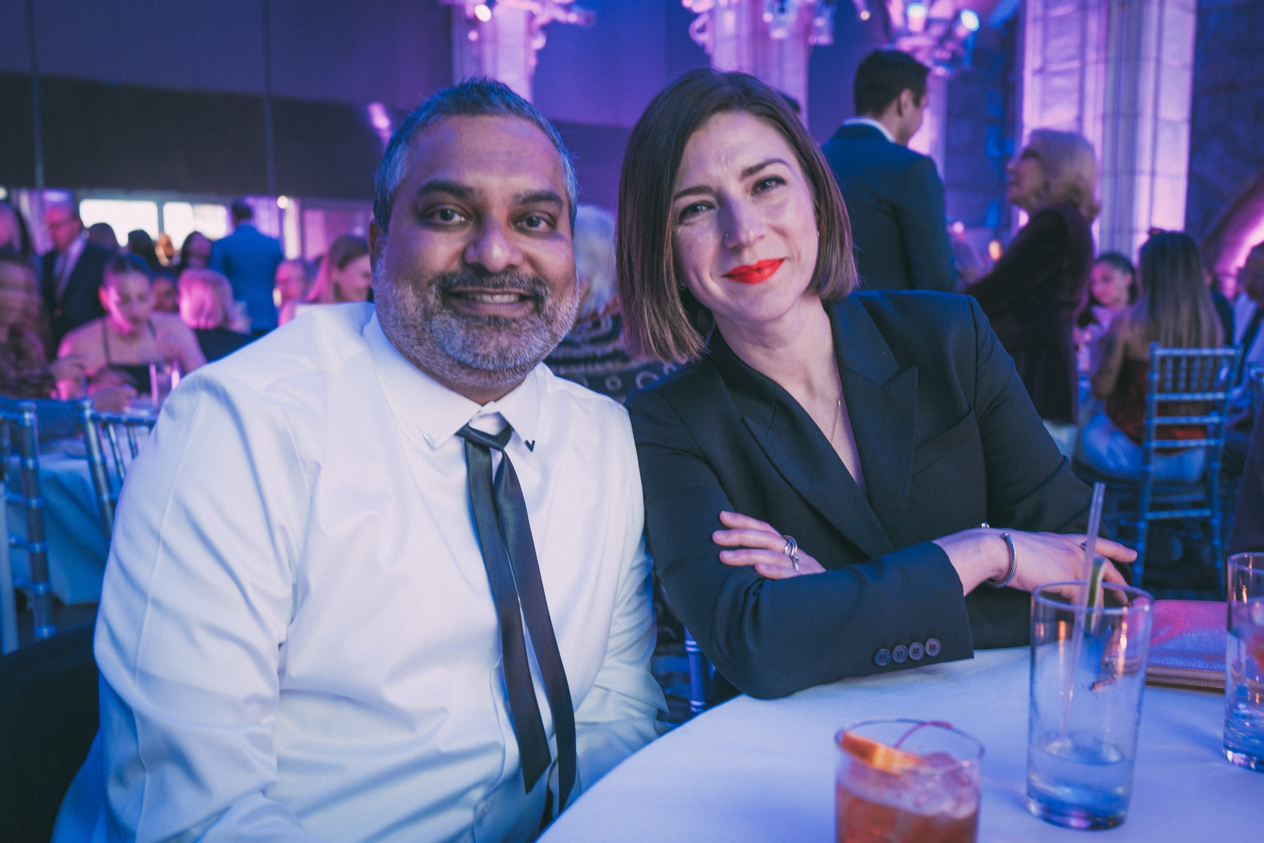
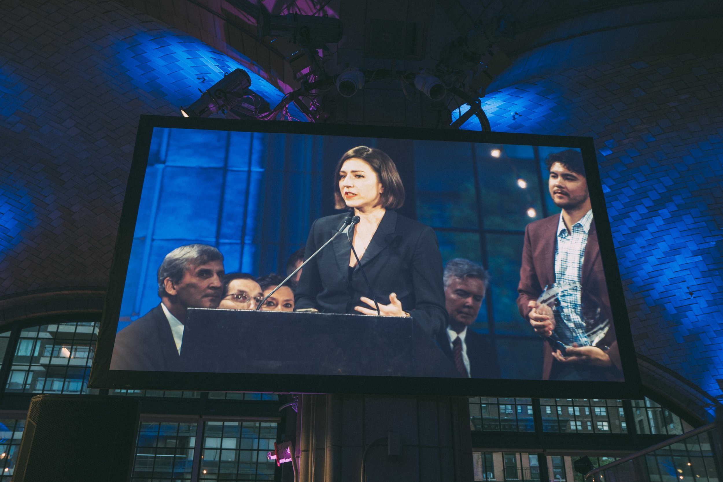
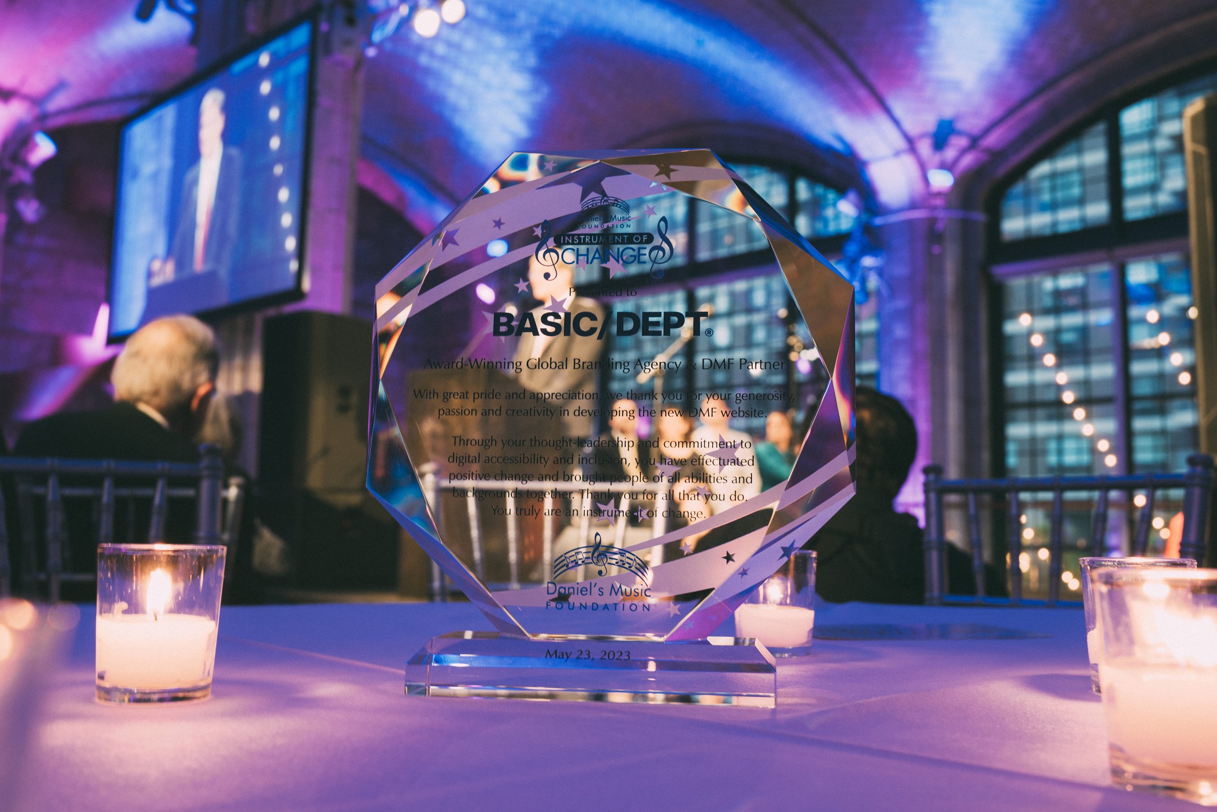
I had the honor of accepting an award on our behalf and took advantage of the opportunity to speak about the importance of accessibility and belonging in the digital world and beyond.